Collibra wanted to scale their design system. At the state that i joined, their system was not able to catch all the necessary edge cases and flows. Adoption and scale are one of the largest challenges when introducing the idea to teams. However, the engineering team were already familiar with design systems and were excited to incorporate the design team.
With heaps of tech debt and inefficient production loops, there was several things that can be solved with a focused pipeline
With a small group of design system designers, several product designers, and a designated engineering team, we were able to pull of a scalable, yet flexible design system.
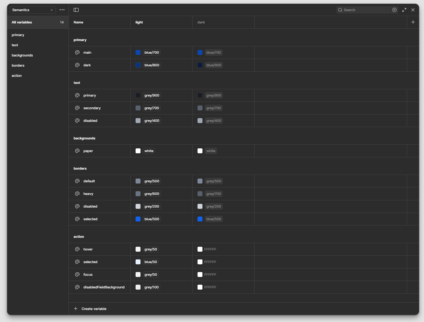
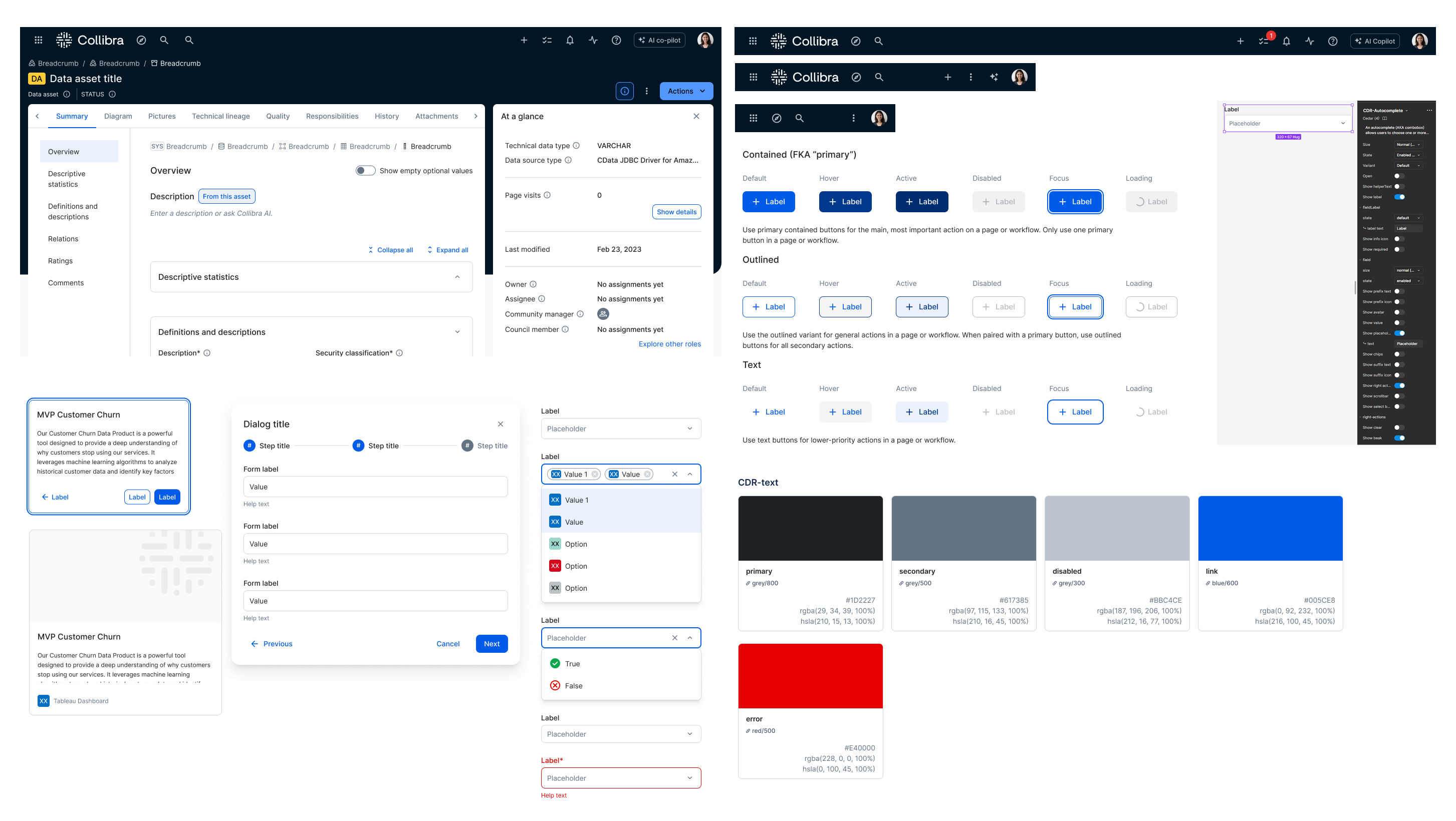
We created a repository through Storybook to keep our components inline. We created two libraries one for front-end so engineers can have a space to contribute and govern and a dedicated design system which our engineers and designers own. We created workshops, guidance, positive feedback loops to make sure everyone is able to be set up for success and evangelize our mission to create a successful product.
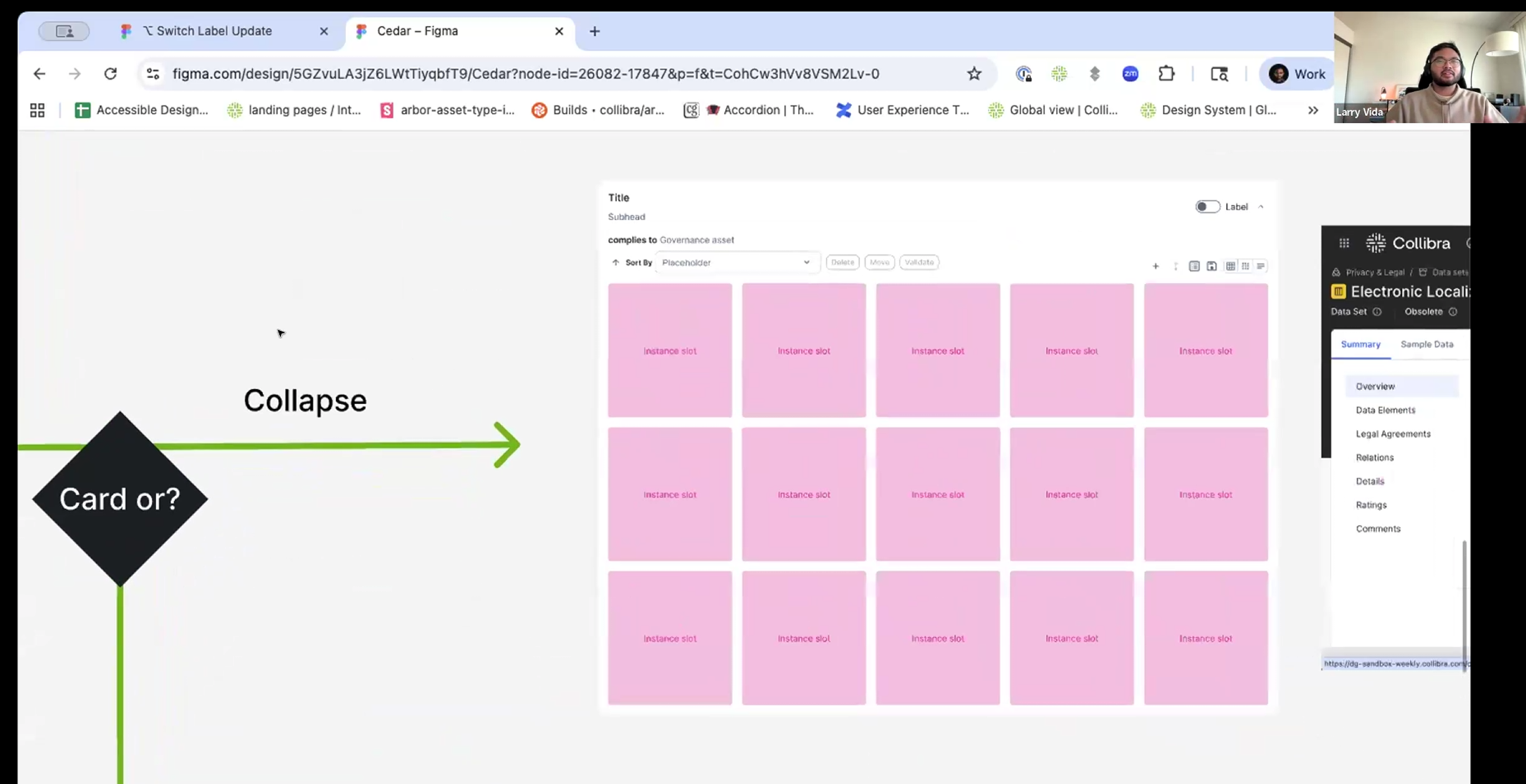
The process can be broken down to four stages. Governance where we determine the value of the component and its impact. We discuss prioritizing and intake that into our Jira board. We create the designs in a branch where we discuss with stakeholders/developers for quality. We run test builds and prepare handoff. The developers will get it ready for release and we communicate to our department on the updates.
After a component/feature is finished, we communicate the updates through slack. We also have space for our designers to collaborate and share work every week for our Product Designers and System Designers. UX writing and engineering are encouraged to participate.
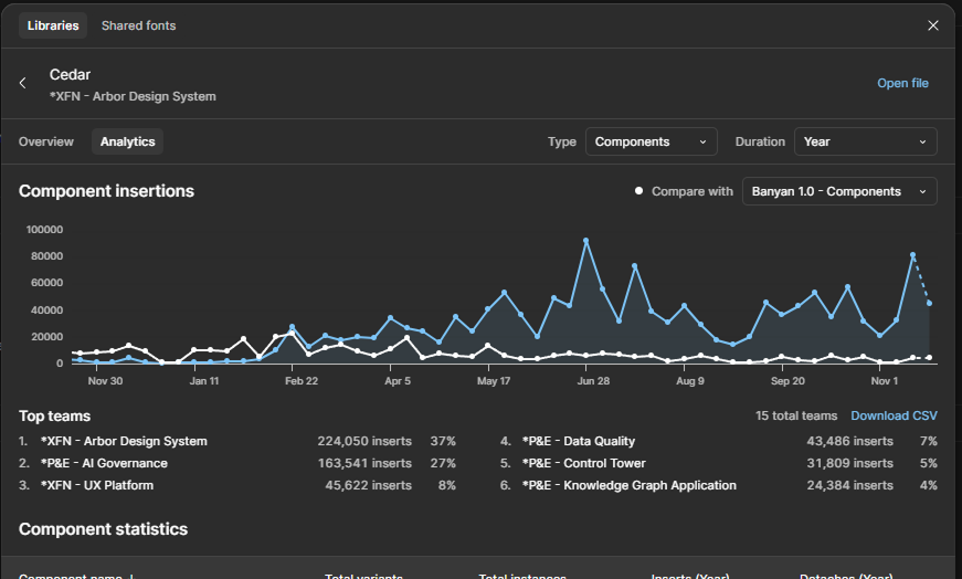
We track participation and usage by watching the library analytics which shows us which components are currently being used. With the transition between design systems we were able to time when to start sunsetting the older design system.
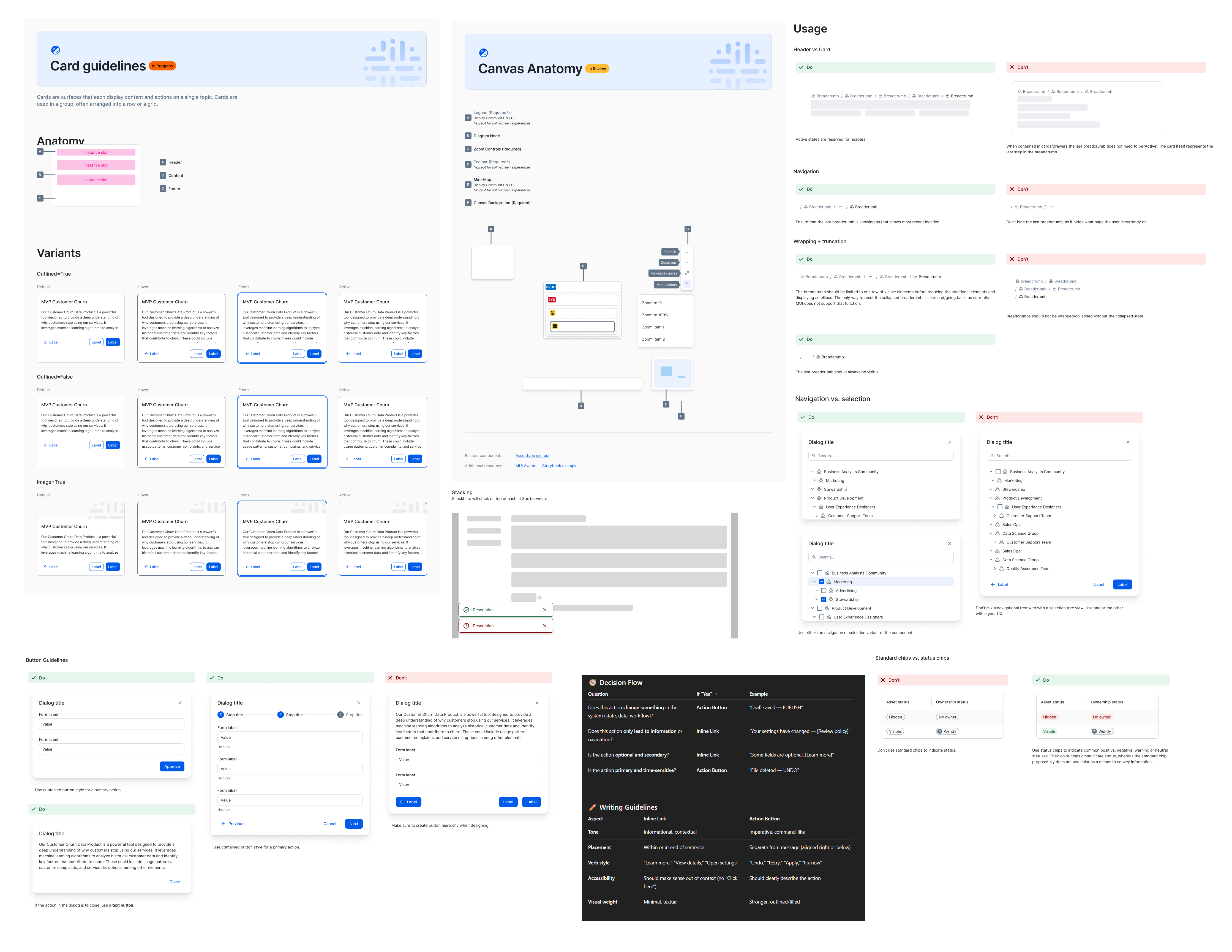
Alongside components we've created documentation and guidelines. There are scenarios within curating these guidelines that we have used AI tools to get a sense of best practices. Getting a sense of how generally components are used can help our team create more nuanced guidelines as our platform can be complex with our platforms users.
The original design system was built with a priimitive sticker sheet of components. It covered most uses cases, however it had an outdated apperance. Figma at the time just recently introduced autolayout.
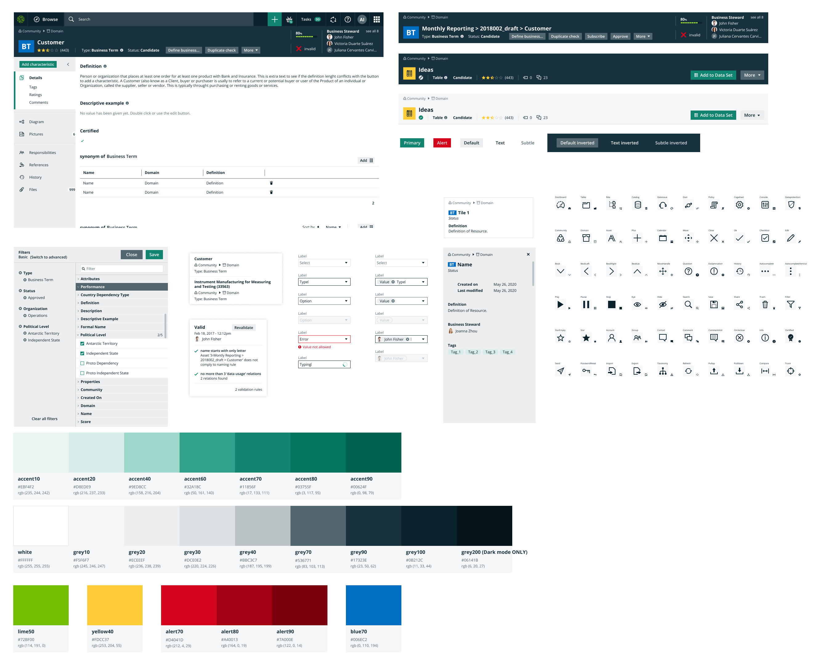
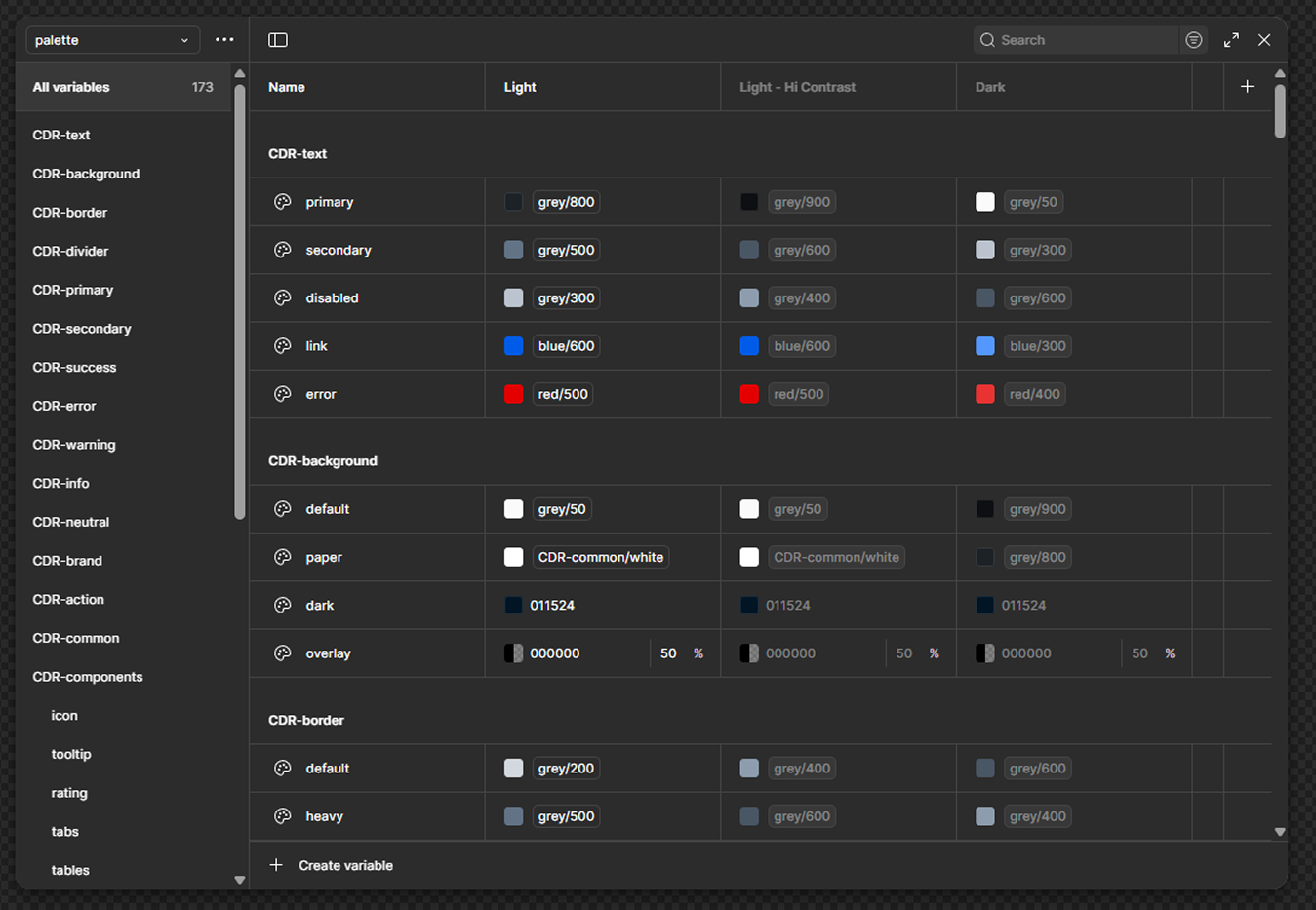
Aspen wanted to focus more on updating the color palletes and updating typography. Minimal changes to not disrupt any longtime clients. We pivoted to a lighter color scheme to have a more modern look and feel. Figma updated with properties which helped with downsizing on extra components.
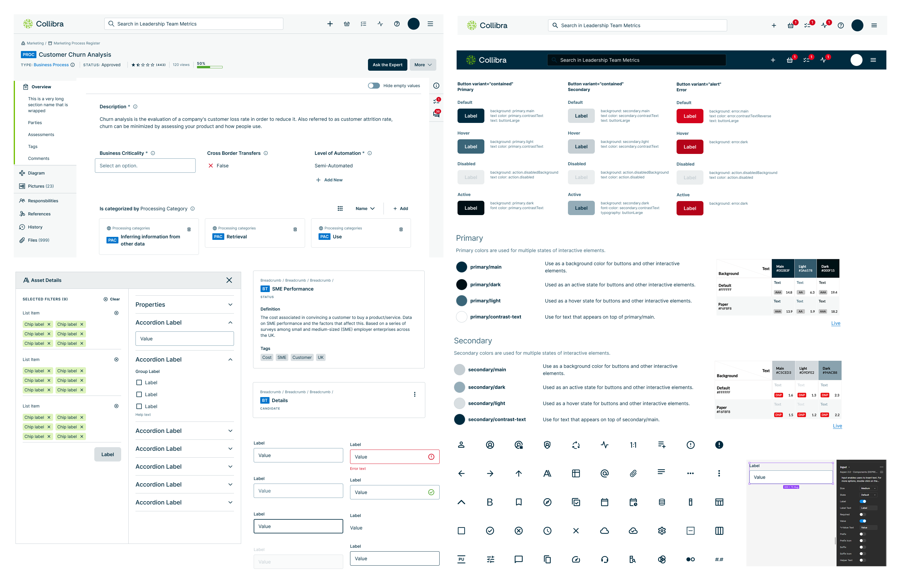
We used MUI as our library foundation and reduced customization of components that lead to tech debt. We introduced Storybook and Chromatic, which helped with better design and engineering parity. Clients asking for consumer grade designs and accessibility, which lead to working Level Access to redo our type scale and contrast ratios. This new design system has helped us secure clients and proved that we listened to their feedback.
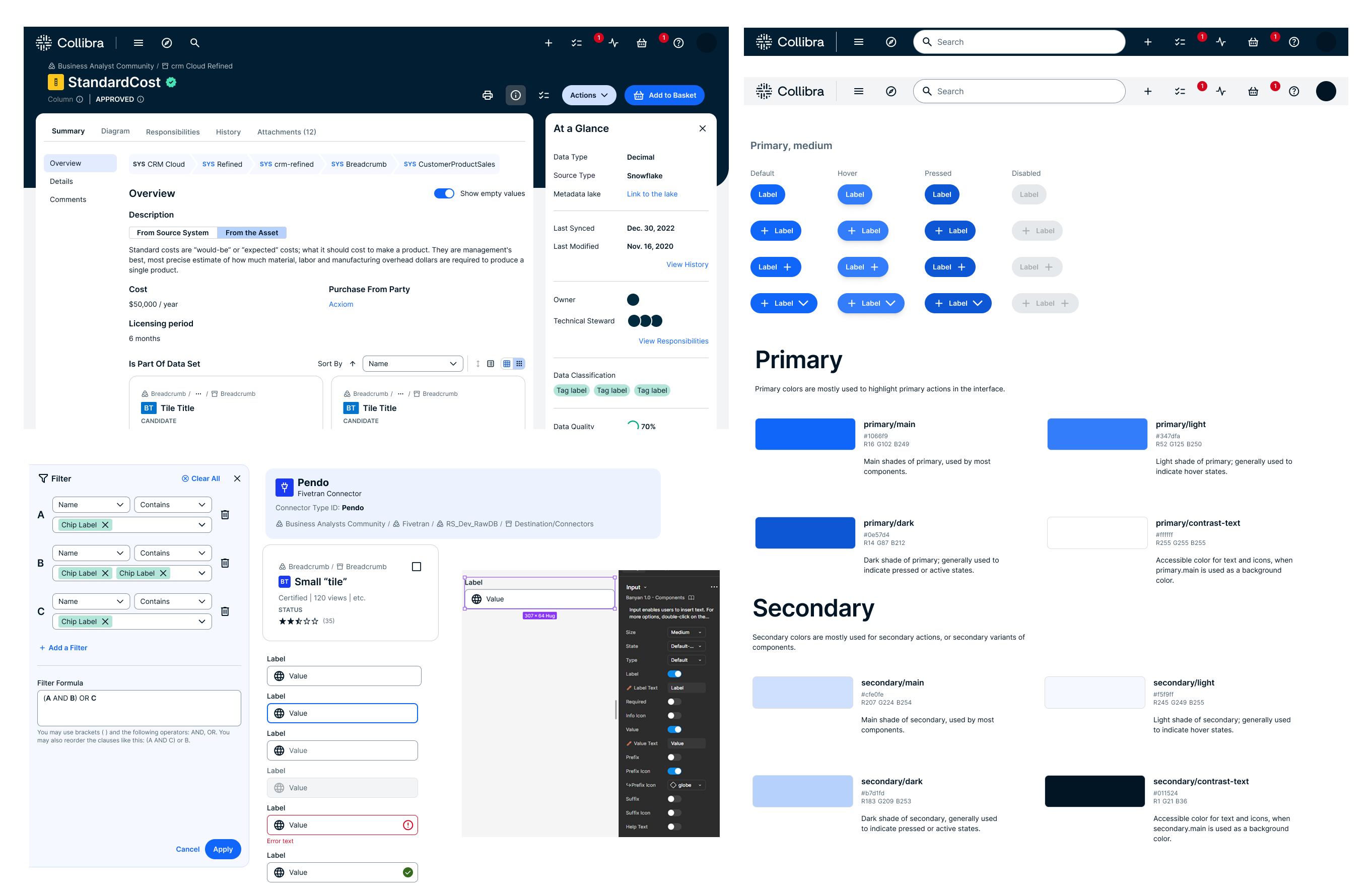
We used MUI as our library foundation and reduced customization of components that lead to tech debt. We introduced Storybook and Chromatic, which helped with better design and engineering parity. Clients asking for consumer grade designs and accessibility, which lead to working Level Access to redo our type scale and contrast ratios. This new design system has helped us secure clients and proved that we listened to their feedback.
I have the amazing opportunity to create and design systems. I learned how much work and collaboration is involved to make sure everyone is moving towards the same goal. It taught us how to be flexible yet firm on guidance and decisions. Pushing Figma libraries as far as it can go with multiple libraries and maintenance. There are always turning gears in the background with several processes to make sure that were set up for success.